
 |
| Batman Invitation Layout Design for First Birthday |
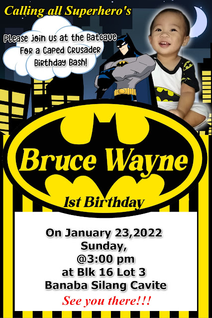
When selecting colors for a personalized Batman invitation template, it's essential to capture the essence of the Dark Knight. Here's a breakdown of the most effective color palettes:
Classic Batman Color Schemes:
* Black and Yellow:
* This is the most iconic combination. Black represents the darkness of Gotham City, while yellow signifies the Bat-Signal and Batman's symbol.
* This high-contrast pairing is bold, dramatic, and instantly recognizable.
* Black, Gray, and Yellow:
* Adding gray softens the palette slightly, providing depth and a sense of urban grit.
* This combination is particularly effective for designs that aim for a more realistic or "dark" aesthetic.
* Dark Blues and Grays:
* Especially in more modern Batman interpretations, dark blues and grays are used to create a moody and mysterious atmosphere.
* This is a good choice for those wanting to represent the more recent batman movies.
Color Considerations:
* Contrast:
* Ensure sufficient contrast between the background and text for readability. Yellow text on a black background is a classic example of excellent contrast.
* Theme:
* Consider the specific Batman theme you're aiming for. A classic comic book theme might favor bright yellows, while a "Dark Knight" theme might emphasize dark grays and blues.
* Age Appropriateness:
* For younger children, you might consider adding subtle pops of brighter colors, while still maintaining the core Batman palette.
Here's a quick guide:
* For a bold and classic look: Black and yellow.
* For a dark and gritty feel: Black, gray, and a touch of yellow.
* For a modern and mysterious vibe: Dark blues and grays.
By carefully selecting your colors, you can create a Batman invitation that is both visually appealing and perfectly captures the spirit of the Caped Crusader.
No comments:
Post a Comment